Q: How is the ‘decoy effect’ used to increase add-on and bundle sales in SaaS?
It’s an interesting question in SaaS. Do we see the classic ‘decoy effect’ — vs. just highlighting the most popular version — on SaaS pricing pages?
The classic decoy effect is the Medium tub of popcorn, priced just below the Large to make the Large seem cheap:
What do we see in SaaS? Let’s take a look at some leading players that sell, at least in part, to SMBs, to see what they do on their pricing pages.
Let’s look at Intercom:
A super-clean pricing page that certainly suggests you should pay $499/month for Accelerate, which seems cheaper than Scale and thus … cheap. But is this a true ‘decoy effect’?
Maybe it is, but if you just want classic Intercom chat, you just need the Start or Grow editions. Perhaps though either way, the decoy effect works, making Start+Grow also appear cheap.
Let’s look at Hubspot, which now has a lot of products to sell:
There’s so much complexity here, I’m not sure there’s a real decoy effect to get you to buy more products or bundled products:
In fact, while Bundles are a tab at the top, they aren’t highlighted in any fashion.
Let’s look at Wix, which sells primarily to SMBs:
We do seem to see a clear ‘decoy effect’ on pricing for basic web pages, with Pro appearing ‘cheap’ compared to Unlimted and Combo vs VIP. It does seem to really work here:
Certainly, with limited time, I’d just buy Pro myself. But again, this is only for the one product.
Let’s look at Dropbox.
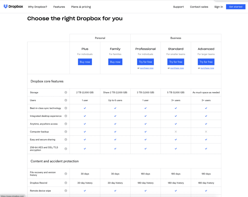
Boy, the Dropbox pricing page has changed a lot. With relatively slow growth, the strategy here seems to be less about getting you to convert to paid fast, than maximizing the price you do pay. Pricing is below the fold, and there is an overwhelming amount of feature discussion before you even get there:

Whatever complexity strategy is being deployed here, it doesn’t seem to be a simple decoy effect. Dropbox has dramatically increased its pricing over the years, from $5 a month years ago, and deemphasized free users. This is a classic strategy for a very mature company, and for most start-ups, there may not be as much to learn here.
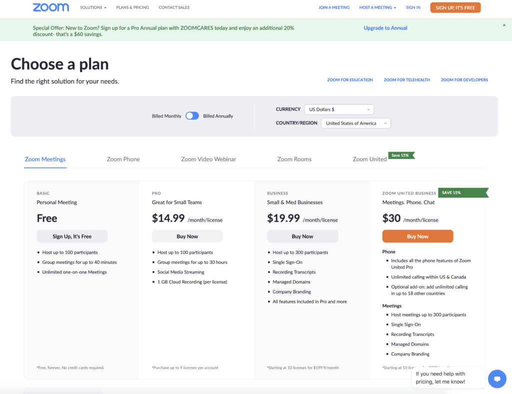
Let’s look at Zoom, which has SMB roots but is more and more focused on enterprise these days. Zoom’s pricing page has actually gotten a tiny bit confusing as they push Zoom United Business, their combo product with phone, at the highest price point. The page uses the ‘decoy effect’ twice, one to get you to pay $19.99/month for Zoom web conferencing alone, and then again to pay $30 for phone added in.
You see this a lot as a company adds products and segments, where there’s conflict which single call of action is most important anymore:

Lastly, let’s look at Shopify, which is SMB+SME focused but sells to customers of all sizes:

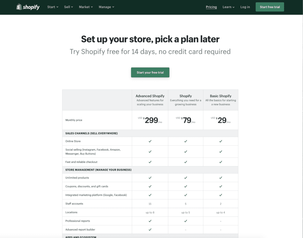
We do seem to see a classic ‘decoy effect’ here, if perhaps not quite as direct as Wix. “Shopify” at $79/month seems cheap when sandwiched between Advanced and so-called “Basic”, even though $79/month is more expensive than some other low-end products. There is still a ‘Lite’ version at $9/month, but it’s hidden at the bottom of the page.
Shopify seems to have an elegant approach, not requiring a credit card to get going, but clearly suggesting the middle tier is a great place to start.
I have to give Medium credit for absolutely the cleanest pricing page in the history of mankind back to the stone age pic.twitter.com/80HpShtPQv
— Jason ✨BeKind✨ Lemkin ⚫️ (@jasonlk) December 21, 2020

